Introducing the Engagement Dashboard
New Feature
See whether your learning programme is working, with numbers you can put in front of your board.
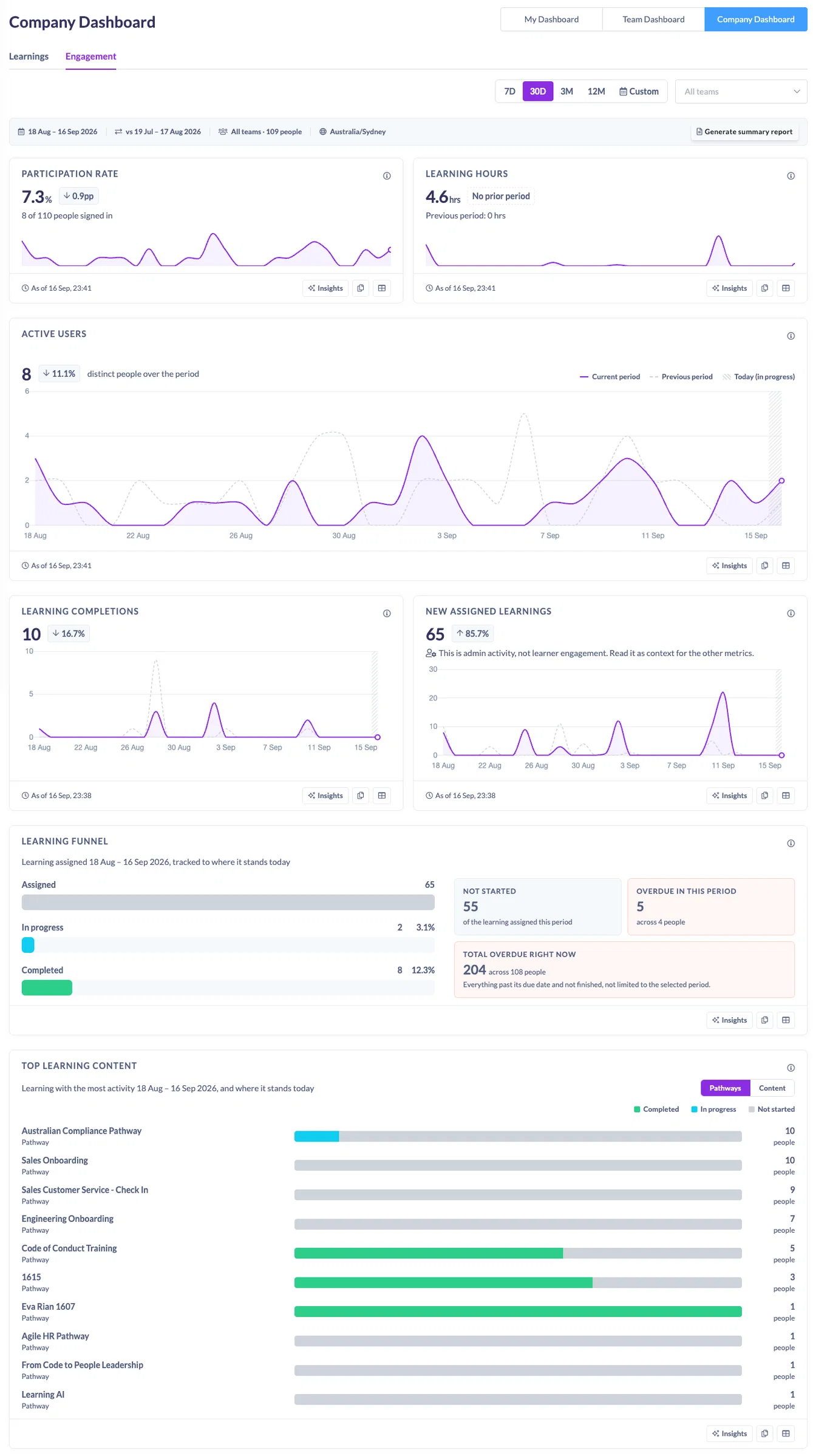
The Engagement Dashboard replaces Company Analytics. It answers one question directly: is engagement healthy, and where is it weak? Participation, learning hours, active people, completions and overdue work all sit on one page, each against the period before it, filterable by team.
What you get
- Two headline figures. Participation rate, the share of your active people who signed in during the period, and estimated learning hours completed.
- Three trends. Active people, learning completions, and newly assigned learning, each compared with the previous period.
- A learning funnel. Everything assigned during the period, tracked to where it stands today: completed, in progress, not started. Plus overdue, shown both within the period and as your total exposure right now.
- Top learning content. The pathways and content people engaged with most, and where those people stand today.
- A view for managers. Anyone with direct reports gets the same dashboard scoped to their own team.
What makes it different
- One definition per number, everywhere. Each metric has a single written definition. Click the information icon on any card and read it. That same definition is what the AI reads, what a copied chart carries in its caption, and what the summary report quotes. No more two screens disagreeing about what an active user is.
- History that stays put. Figures are built from a daily record, so a closed month reads the same next quarter as it does today. Deactivating someone does not quietly rewrite your last report.
- It tells you what it does not know. A period that includes today is marked as still in progress and its comparison uses elapsed days, so you are never comparing nine days against thirty. Estimated hours are labelled estimated wherever they appear, including in exports. A small team is flagged rather than hidden. Where there is no comparable earlier period, it says so instead of showing a fall that never happened.
- No scores, no targets, no traffic lights. It shows you what moved and by how much. Judging it is your job, because only you know what good looks like for your organisation.
- Made for reporting upward. Copy any chart as an image and it arrives with the period, comparison window, team filter, time zone and the time you took it, so it cannot be misread once it leaves the page. Copy the underlying numbers for a spreadsheet. Or have the AI Assistant draft the whole summary, which you then edit and send as your own.
Where to find it
Dashboard, then the Engagement tab. Any old Company Analytics link still works and will bring you here. Discussion analytics has moved to Reports, where it now honours the date range you pick.
Three years of history is available from day one.